

Introduction
A few months ago, I gave a talk with a coworker at the tech conference Connect.Tech about the ever-growing need for responsive web design when building websites and applications. We discussed a couple of different ways to approach it, specifically when it comes to the JavaScript framework React.
In case you’re unfamiliar with the term, let me quickly define responsive web design so we’re all starting at the same point. The best definition I’ve found comes straight from Smashing Magazine, a leading editorial voice for web developers and web designers.
“Responsive web design is the approach that suggests that design and development should respond to the user’s behavior and environment based on screen size, platform, and orientation.” — Smashing Magazine
It should already make sense why it’d be evermore necessary in today’s world to start with responsive design for multiple browser/device sizes in mind as you build applications, but in case you’d like a few statistics, here are some that should help to convince you.
“57% of users say they won’t recommend a business with a poorly designed mobile site.” — socPub
In other words, a poor mobile presence (or, worse still, no mobile presence at all) can make your organization look unprofessional and out of touch with the modern consumer. Here’s another:
“83% of users say a seamless experience across all devices is very important.” — Wolfgang Jaegel
Consumers today expect a seamless experience and brand consistency regardless of what device they’re using to interact with your brand. Consider this chart from August 2018-August 2019 showing the average screen sizes of users worldwide.
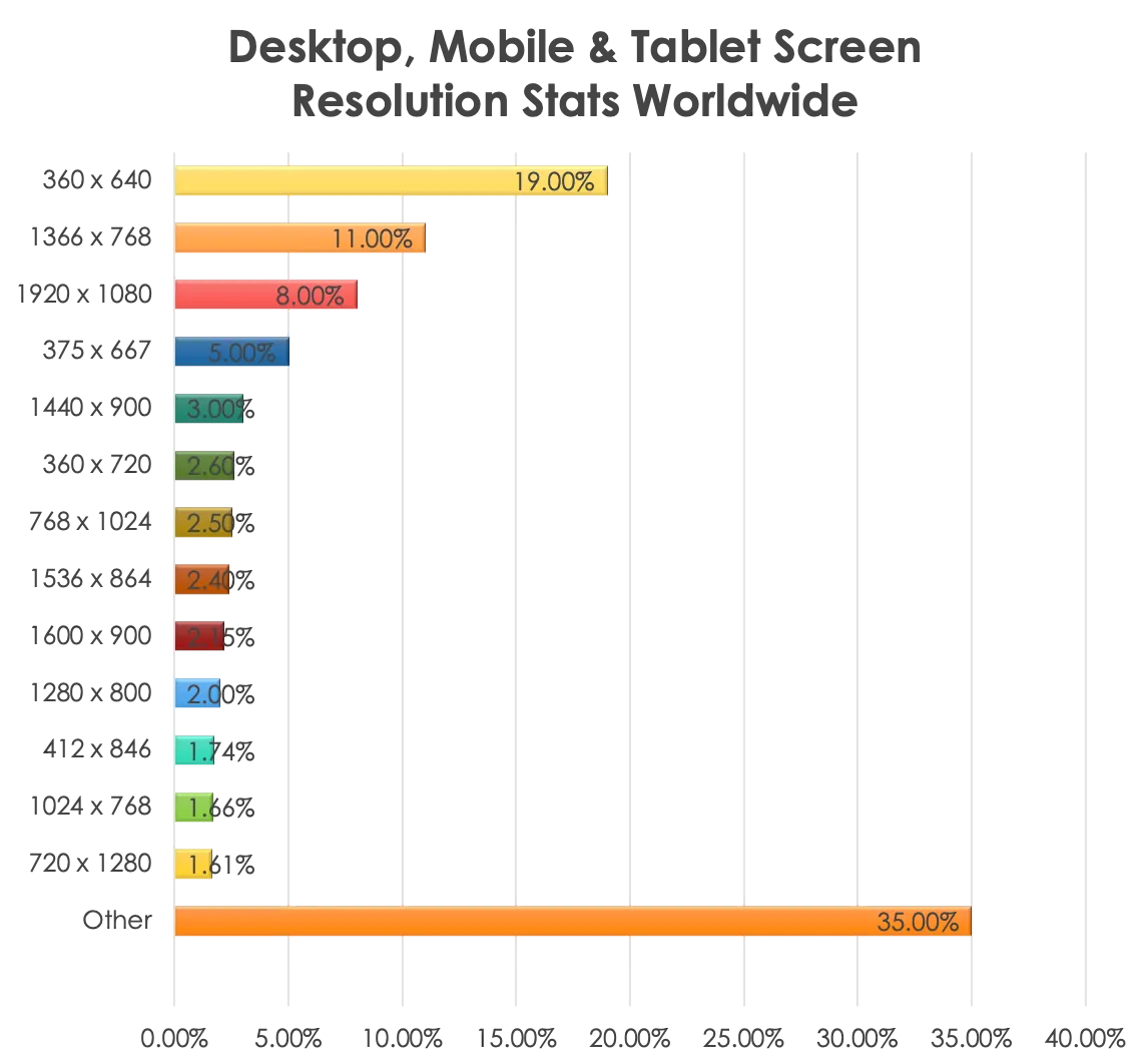
In 2020 and beyond, all signs point to a need for responsive design to meet users wherever they are.
While I won’t go into all the details we went into in our talk of how to approach responsive design, I’d like to share two possible approaches to responsive design for anyone else looking to get started with it.
This piece will cover the second solution for responsive web design, which is specific to the JavaScript framework React: using React Socks to conditionally render elements based on viewport size.
If you’d like to see the first solution I talked about (CSS media queries), you can see my post here.
What is React Socks?
React Socks is a React library designed to render components based on specific viewports.
While CSS media queries are used to show and hide elements always present in the DOM, React Socks goes one step further, helping to conditionally render elements based on viewport size. This means unless the components are the right size for the current viewport, React Socks won’t render the component (or its accompanying CSS) at all.
What this boils down to is:
- Rendering viewport-specific components without hassle
- The ability to name and define your own breakpoints where you need them (React Socks also has predefined breakpoints as well, if you prefer not to customize them)
- The potential for improved app performance if you lazy load viewport-specific components
- Simpler and sweeter syntax, for ease of use
Using React Socks
Implementing React Socks is actually easy, as well. To begin, you wrap your top-level component (probably App) with a <BreakpointProvider> tag, and then you can use the <Breakpoint> tag anywhere you need inside the rest of the application.
BreakpointProvider implementation
Here’s how I wrapped my app at the top level with <BreakpointProvider>.
App.js
import React from 'react';
import { BrowserRouter as Router, Route, Switch } from 'react-router-dom';
import { BreakpointProvider } from 'react-socks';
import NowPlaying from './containers/NowPlaying/NowPlaying';
import Dashboard from './containers/Dashboard/Dashboard';
import Upcoming from './containers/Upcoming/Upcoming';
import MovieSearch from './containers/MovieSearch/MovieSearch';
import Genres from './containers/Genres/Genres';
import Header from './containers/Header/Header';
import './App.css';

function App() {
  return (
    <BreakpointProvider>
      <div className="App">
        <Router>
          <LastLocationProvider>
            <Header />
            <Switch>
              <Route exact path="/" component={Dashboard} />
              <Route exact path="/search" component={MovieSearch} />
              <Route exact path="/nowplaying" component={NowPlaying} />
              <Route exact path="/upcoming" component={Upcoming} />
              <Route exact path="/genres" component={Genres} />
            </Switch>
          </LastLocationProvider>
        </Router>
      </div>
    </BreakpointProvider>
  );
}

export default App;
Import it from React Socks at the top of the file, and wrap the whole app. Done!
Once that’s taken care of, you’re free to start using the <Breakpoint> tag throughout your app wherever you need responsiveness.
Breakpoint implementation
This is an example of setting up breakpoints inside of a component using the <Breakpoint> tag.
In addition to the actual Breakpoint tag wrapper, you’ll need to include a size [React Socks’ defaults are xsmall (0px), small (576px), medium (768px), large (992px), and xlarge (1200px)] and a modifier of down, up, or only.
Down means anything up to that particular breakpoint and below it, up means anything down to that particular breakpoint and above it, and only (or no modifier) means only within that particular breakpoint’s pixel ranges. It may make more sense if you look at the example below.
The first snippet is the JSX code, and the second is the CSS that goes along with the different breakpoints.
Genres.js
    return (
      <div className="genres-page">
        <h1>Choose a Genre</h1>
        {(error || loading) && <h3 className="genre-info">{info}</h3>}
        <Breakpoint large up>
          <div className="genre-list">
            {this.renderRedirect()}
            {genreInfo}
          </div>
        </Breakpoint>
        <Breakpoint medium>
          <div className="genre-list">
            {this.renderRedirect()}
            {genreInfo}
          </div>
        </Breakpoint>
        <Breakpoint small down>
          <div className="genre-list">
            {this.renderRedirect()}
            {genreInfo}
          </div>
        </Breakpoint>
      </div>
    );
Genres.scss
.genre-list {
    display: grid;
    grid-template-columns: repeat(4, 1fr);
    max-width: 1200px;
    grid-gap: 15px;
    justify-items: center;
    margin: auto;
    h3 {
      margin: 200px auto;
    }
  }

.breakpoint__medium-only {
  .genre-list {
    grid-template-columns: repeat(3, 1fr);
  }
  h3 {
    font-size: 18px;
    width: 80%;
  }
  .genre-component {
    width: 170px;
    height: 170px;
    h3 {
      font-size: 22px;
    }
  }
}

.breakpoint__small-down {
  .genre-list {
    grid-template-columns: repeat(2, 1fr);
  }
  h3 {
    font-size: 18px;
    width: 80%;
  }
  .genre-component {
    width: 140px;
    height: 140px;
    font-size: 18px;
  }
}
In the example above, the first Breakpoint wrapper dictates that whenever a viewport is large up (i.e. 992px or greater), the first CSS listed will be rendered (the one with grid-template-columns: repeat(4, 1fr);).
The second Breakpoint wrapper will render only between the viewport sizes of 991px and 577px because its breakpoint size is set as medium. And the CSS that goes with it is conditionally rendered by being wrapped inside the class of .breakpoint__medium-only. This CSS class is added by the addition of the React Socks Breakpoint package — no modification by you is necessary.
And the third will render whenever the viewport is 576px or smaller because it’s set as small down inside the Breakpoint component. And, likewise, the CSS for including grid-template-columns: repeat(2, 1fr); will only ever render at that viewport size as well.
This kind of conditional rendering of components can shrink the CSS bundle size and clean up the CSS being loaded into the browser significantly by only loading what the view requires and nothing else.
How I used React Socks in my React app
Along with the conference talk we gave, there were three React movie demo sites I built to illustrate my point, using the Movie Database API for a data source.
The first site was completely unresponsive to show the poor user experience across multiple devices.
The second site was built with CSS media queries, making it responsive for tablet and mobile. And the third site was built using the React-specific responsive library React Socks to make it responsive.
This third demo is what I’m showing snippets of code from in this piece. If you’d like to see the whole codebase, it’s available on GitHub, and if you’d like to see a live version of the site, it’s available at this URL.
So above was one example of how to use React Socks, but let me show you another example where it really shines. When you have quite different layouts or components, you need to render based on viewport size. This is where React Socks excels.
Basic component example
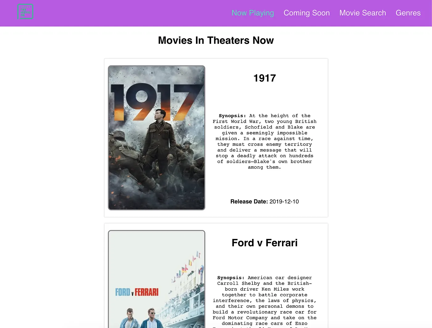
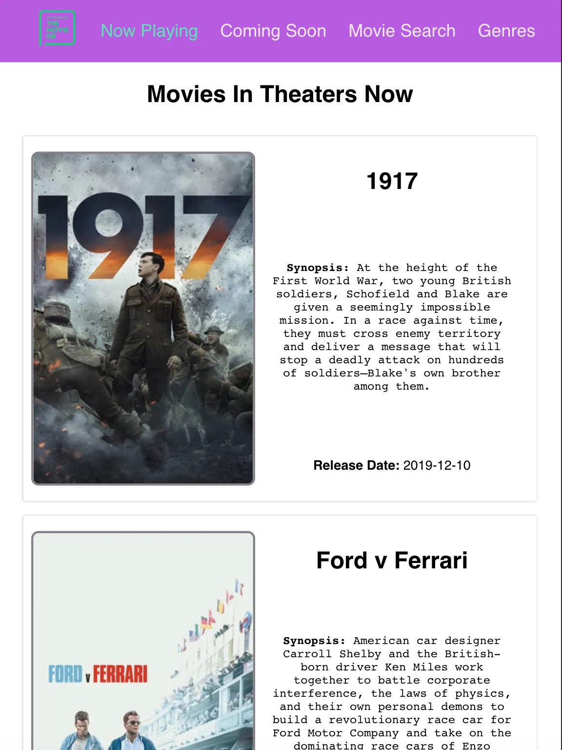
Desktop and tablet views
Here are two screenshots of my movie app in both desktop and tablet size, showing the header-based navigation bar present throughout the app.
For both of the larger sizes, the links to the different pages are always visible (Now Playing, Coming Soon, Movie Search, and Genres — plus a link back to the Dashboard landing page on the far right side).
Desktop view
And here’s the tablet view. Once again, there’s enough room across the top for all the links to be present.
Tablet view
Now, here’s a shot of the React JSX that goes along with those views.
As you can see, the Breakpoint wrapper uses medium up to display the header, while the viewport is 577px and above. When the viewport is smaller than that, React Socks makes it possible to render a completely different component named <Sidebar>.
Header.js
const Header = () => {
  return (
    <nav className="navbar-wrapper">
      <Breakpoint medium up>
        <ul className="navbar-links">
          <li className="navbar-link-logo">
            <NavLink to="/">
              <img src={TmdbIcon} alt="logo" />
            </NavLink>
          </li>
          <div className="navbar-top-links">
            <li className="navbar-link">
              <NavLink to="/nowplaying">Now Playing</NavLink>
            </li>
            <li className="navbar-link">
              <NavLink to="/upcoming">Coming Soon</NavLink>
            </li>
            <li className="navbar-link">
              <NavLink to="/search">Movie Search</NavLink>
            </li>
            <li className="navbar-link">
              <NavLink to="/genres">Genres</NavLink>
            </li>
          </div>
        </ul>
      </Breakpoint>
      <Breakpoint small down>
        <Sidebar />
      </Breakpoint>
    </nav>
  );
};
Sidebar component switched in with React Socks
Mobile size
But here is a screenshot of what the same header looks like in mobile view: It turns into a sidebar that slides in from the left with the same links available when a user taps the hamburger bar in the top-right corner.
And, once again, the link back to the homepage (the Dashboard page) is now in the right-hand corner.
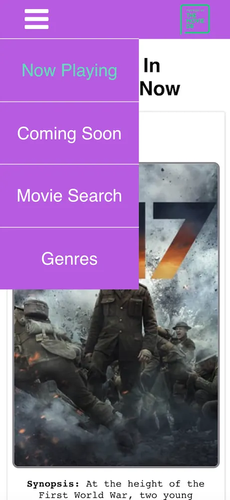
This view is actually rendered by the Header component’s child component, Sidebar, because Sidebar is wrapped inside of the React Socks breakpoint of small down. As long as the viewport size is under 576px, the Sidebar component will render instead of the Header — with its links across the top.
Here is the JSX for the Sidebar component.
Sidebar.js
const Sidebar = () => {
  const [expandedLinks, setExpandedLinks] = useState(false);

  const toggleLinks = () => () => {
    setExpandedLinks(!expandedLinks);
  };

  return (
    <>
      <ul className="sidebar-top">
        <div className="sidebar-links">
          <li className="sidebar-link bars" onClick={toggleLinks()}>
            <i className="fa fa-bars" aria-hidden="true" />
          </li>
          <li
            className="sidebar-link-logo"
            onClick={() => setExpandedLinks(false)}
          >
            <NavLink to="/">
              <img src={TmdbIcon} alt="logo" />
            </NavLink>
          </li>
        </div>
      </ul>
        <div>
          <li className="sidebar-link" onClick={() => setExpandedLinks(false)}>
            <NavLink to="/nowplaying">Now Playing</NavLink>
          </li>
          <li className="sidebar-link" onClick={() => setExpandedLinks(false)}>
            <NavLink to="/upcoming">Coming Soon</NavLink>
          </li>
          <li className="sidebar-link" onClick={() => setExpandedLinks(false)}>
            <NavLink to="/search">Movie Search</NavLink>
          </li>
          <li className="sidebar-link" onClick={() => setExpandedLinks(false)}>
            <NavLink to="/genres">Genres</NavLink>
          </li>
        </div>
    </>
  );
};
Now, imagine trying to make those two very different components into one that could work well at both desktop and mobile sizes. It might be possible, but the JSX would be messy and the CSS even messier.
React Socks makes it so much easier to simply switch out complete components, making for cleaner code and easier development.
Pros and Cons of React Socks
I’ve covered a few different examples of how to use React Socks to switch React components in and out based on the viewport size, but I feel it’s important to talk about some of the benefits and drawbacks that come along with them.
As I alluded to above, for some situations they can be a great solution, but they may not perfect for solving every responsive design need.
Let’s talk about the highlights first.
Benefits
- Ideal when you have very different components or layouts to render based on viewport size — as you’ve seen in the header/sidebar example above, the desktop and mobile views and functionality are quite different.
- Trying to shoehorn those into one component and use pure CSS media queries to show and hide different pieces of the component at different screen sizes would have been messy and more complex.
- Custom breakpoints can be named and set — if you need more specific breakpoints than the default set by React Socks, it’s easy.
- If you wanted a breakpoint for extra, extra large monitors, you could simply name it
giantMonitorand set a viewport size with it. Likewise, if you wanted one calledpizzaorbicycle, you could do that too. It’s totally up to you and your needs.
- If you wanted a breakpoint for extra, extra large monitors, you could simply name it
- Less CSS is rendered per view than with media queries — as I mentioned before, React Socks only renders the component that’s wrapped within its
Breakpointtags (and the CSS that goes along with it).- Smaller CSS bundle sizes can mean faster page load times, especially for mobile users, resulting in a better user experience.
React Socks only has one major drawback I identified while trying it out.
Drawbacks
- The biggest drawback to React Socks: It can be overkill for code that keeps its same structure and just needs to adjust its height, width, margin, padding, etc.
- For minimal changes that keep the same layout and DOM elements, it may be quicker to just add some more CSS wrapped in a media query instead of having to define the same component multiple times wrapped in
Breakpointtags and the CSS to go with it.
- For minimal changes that keep the same layout and DOM elements, it may be quicker to just add some more CSS wrapped in a media query instead of having to define the same component multiple times wrapped in
And that’s really the only thing I can point out when you’re considering whether to employ React Socks or not.
Conclusion
Responsive web design is of paramount importance to every designer and developer in today’s multidevice world. We can’t even imagine some of the scenarios where applications might be used, and we can’t afford to give users a bad experience — because our competitors won’t.
There are plenty of solutions out there, but one of the approaches I chose to investigate is using the React-specific library React Socks to make sites responsive. It’s specifically tailored to work with the React framework, and it’s very easy to get started with.
React Socks renders only the components and CSS necessary for the viewport and nothing else, it’s easy to create custom breakpoints if needed, and it provides an option for cleaner, easier-to-read code and better app performance. This is a really good option for your responsive needs.
Check back in a few weeks — I’ll be writing more about JavaScript, React, ES6, or something else related to web development.
Thanks for reading. I hope you’ll consider React Socks as you’re designing and building your own responsive React-based web applications. It’s a powerful, versatile solution.