
Introduction
Recently, I gave a talk with a coworker at the tech conference Connect.Tech about the ever-increasing need for responsive web design when building applications, and then a couple of different ways to approach it, specifically when it comes to the JavaScript framework, React.
In case you’re not familiar with the term, let me quickly define responsive web design so we’re all starting at the same place. The best definition I’ve found comes straight from Smashing Magazine, a leading editorial voice for web developers and web designers.
“Responsive web design is the approach that suggests that design and development should respond to the user’s behavior and environment based on screen size, platform, and orientation.” — Smashing Magazine
It should already make sense why this would be more and more necessary in today’s world to start with responsive design for multiple browser/device sizes in mind as you build applications, but in case you’d like a few statistics, here are some that should help to convince you.
“In 2018, 52.2% of all website traffic worldwide was generated through mobile phones, up from 50.3% in the previous year.” — Statista
And:
“On average, 88% of global consumers report they multiscreen, using 2.42 devices at the same time.” — Adobe
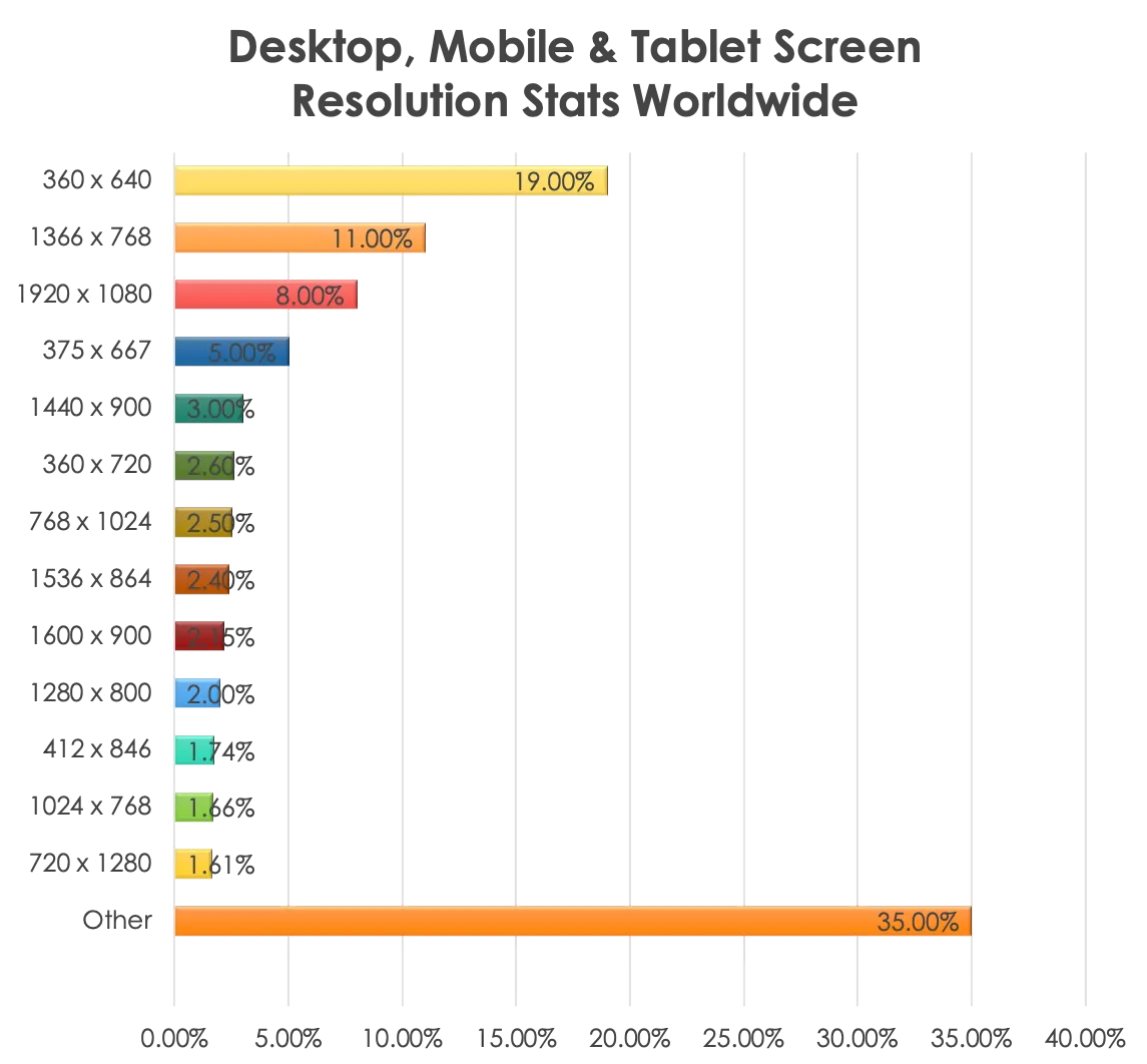
Or consider this chart from August 2018-August 2019 showing the average screen sizes of users worldwide.
In 2020 and beyond, all signs point to a need for responsive design to meet users where ever they are.
While I won’t go into all the details in our talk of how to approach responsive design (if you’d like, you can see the full slide deck of the talk), I would like to share two possible approaches to responsive design for anyone else looking to get started with it.
This article will cover the first solution for responsive web design, which would really work for any JavaScript application as long as it’s using CSS for its styling: CSS media queries.
What are CSS media queries?
Media queries are a popular technique for delivering a tailored style sheet (responsive web design) to desktops, laptops, tablets, and mobile phones.
CSS media queries are usually used to check things like:
- Width and height of the viewport.
- Width and height of the device.
- Orientation (is the device in landscape or portrait mode?).
- Resolution.
They can also be used to specify that certain styles are only for printed documents or for screen readers.
Anatomy of a CSS media query
But by far the most common uses for media queries fall into the first set of bullet points above: checking viewport and device widths and heights to know which CSS styling to serve up.
And here’s an example of what the CSS media query code will look like.
Typical example of a CSS media query
@media only screen and (min-width: 375px) and (max-width: 969px) {
  body {
    background: green;
    font-size: 16px;
  }
}
The @media rule, introduced with CSS3, is used to apply different styles for different media types/devices. only screen applies to all computer screens, tablets, smartphones, etc.
In the example above, this start specifies that the CSS styles ( background: green and font-size: 16px ) defined within will only apply to the body HTML tag for screens between the sizes of at least 375px (min-width: 375px), all the way up to screens of 969px (max-width: 969px).
This is a very basic example, but CSS media queries are incredibly powerful. They can be used to show and hide different elements of the DOM, resize fonts, and switch around whole page layouts with relative ease.
Before I show you how I used them though, let’s talk about the two basic design approaches to take with media queries.
Approaches to CSS media queries
There are two common approaches to writing CSS media queries. They’re known as subtractive CSS and additive CSS.
Neither one is really better than the other, it depends more on the main audience of the application to help determine which approach is right for you.
Questions to help figure this out might include: “Will it be used more on mobile devices or desktops, or will it be a large group of diverse users, or a small internal group of users within a company?” Things like that.
Here are more details about the two approaches.
Subtractive CSS
The first approach, subtractive CSS, is the one that’s probably more commonly taken with applications that will have smaller, more homogenous user bases.
Think internal applications used within organizations for very specific purposes, that oftentimes can only be accessed from a specific device — either because of company firewalls and networks or hardwired terminals, etc.
Subtractive CSS generally starts with the comps and screen styles at the largest resolution first. It begins with the largest displays, and then media queries are added to undo unneeded CSS for the smaller viewports.
Basically, it puts in a bunch of styling that undoes some of the more complex layouts that have been laid out at a higher resolution.
Even though it has subtractive in the name, it usually results in more lines of CSS having to override underlying styles.
Here’s a CodePen you can look at, illustrating subtractive CSS at work. Check out the amount of CSS I had to add to undo the layout from a widescreen view to accommodate a smaller viewport.
If you expand and shrink the viewport, you can watch the styles change for large screen, tablet, and mobile.
Subtractive CSS demo
Additive CSS
Additive CSS is the opposite of subtractive, as the name implies. With additive CSS, you start with the smallest resolution styling first and add media queries to build up the CSS as the screen size increases.
It begins simply, and gets more complicated with the layout as horizontal screen real estate increases.
Additive CSS is probably the more recommended way to begin designing a new application in general. It will make the amount of CSS being loaded at different breakpoints smaller if it’s designed mobile-first and has less CSS to override and undo (better for your end-user experience).
Also, there’s a very good chance users will be accessing the application from a whole variety of different screen sizes and devices you can’t even imagine, and having contingency categories they’ll fall into is vital.
Here’s another CodePen showing additive CSS at work. You can see that in this example, I start with the smallest viewport first, and slowly add more details and layout complexity as the viewport size increases under media queries.
Try playing with the viewport size to see the CSS changes.
Additive CSS demo
I know that both of these examples may seem rather simplistic, but just imagine a larger, multi-screen application (heck, look at most of the apps you use on your phone and your laptop on a regular basis), and think about how you might build them using either approach.
How I used CSS media queries with React
Along with the conference talk we gave, there were three React movie demo sites I built to illustrate my point, using the Movie Database API for a data source.
The first site was completely unresponsive to show the poor user experience across multiple devices.
The second site was built with CSS media queries making it responsive for tablet and mobile.
And the third site was built using a React-specific responsive library called React-socks, to make it responsive.
This second demo is what I’ll be showing snippets of code from in this blog. If you’d like to see the whole codebase, it’s available on GitHub, and if you’d like to see a live version of the site, it’s available here.
Basic component example
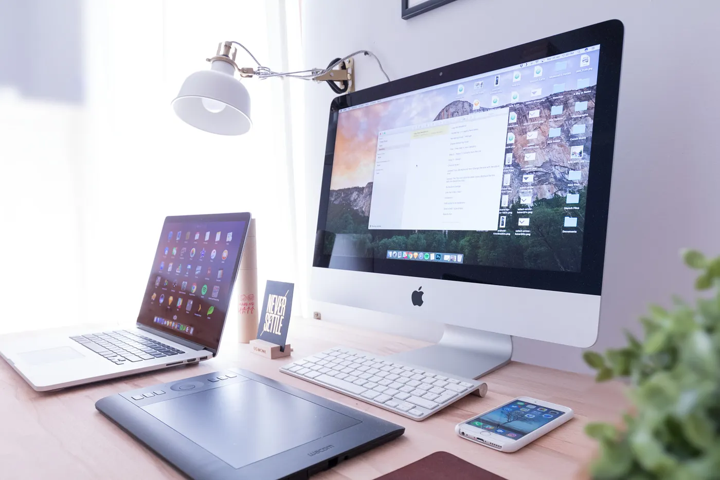
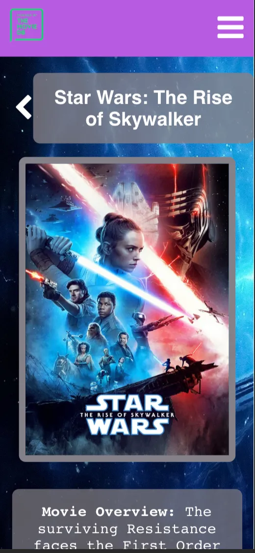
Desktop view
I’ll be showing you a portion of the CSS for the MovieDetails React component in my application. Here’s what the desktop page looks like that uses this component.
As you can see from the screenshot, at desktop size the layout is pretty complex: movie poster backdrop, the official trailer poster on the left side, the movie synopsis, release date, ratings and reviews on the right side, etc.
And here is a snippet of the CSS involved to make the layout for the movie poster happen. This was the base CSS I used to build my smaller screen views from. Yes, this is an example of subtractive CSS.
MovieDetails.scss
.movie-details-poster-wrapper {
  display: grid;
  grid-template-columns: 1fr 1fr;
  grid-template-rows: 3% 450px 450px 80px;
  grid-gap: 15px;
  justify-items: center;

  .movie-details-poster {
    border-radius: 10px;
    border: solid #847f86 10px;
    grid-row: 2;
  }
}
From the code, you see I’m using a CSS Grid layout here for the desktop layout. Now, let’s see how the view and component’s CSS changes as the screen size shrinks.
Same component with media queries
Tablet view
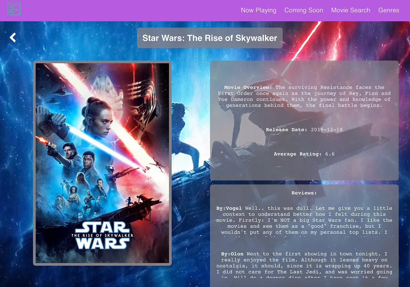
Here is the look of that same React component MovieDetails at tablet size.
At tablet viewport size, the movie poster gets centered in the viewport and the synopsis, ratings, and reviews slide underneath it.
Here’s what a portion of the CSS looks like that goes with this view.
MovieDetails.scss
@media only screen and (min-width: 550px) and (max-width: 1089px) {
    .movie-details-poster-wrapper {
      display: flex;
      flex-direction: column;
      align-items: center;

    .movie-details-poster {
        margin: 20px 0;
      }
    }
  }
For the tablet view, the CSS layout switches from Grid, which is a two-dimensional way of designing layouts to CSS Flexbox, which is a more one-dimensional way of arranging layouts. More appropriate for a view where each element is just laid out in order, one after another.
Straightforward enough.
On to the last example: the mobile view.
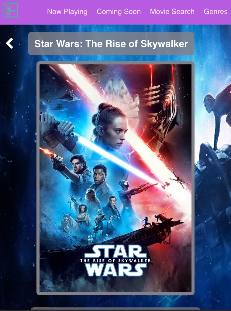
Mobile view
The mobile view more closely resembles the tablet view for the MovieDetails React component. Once again, the movie poster is front and center, the overview and ratings come after.
For mobile, the font size has also increased and now there’s a toggle on the reviews to “Read more…” instead of the user being able to scroll through the whole review from the start as they can at larger view sizes.
Here’s the last example of the CSS that accompanies it.
MovieDetails.scss
@media only screen and (max-width: 549px) {
    .movie-details-poster-wrapper {
      display: flex;
      flex-direction: column;
      align-items: center;

    .movie-details-poster {
        width: 300px;
        margin: 20px 0;
        overflow-y: scroll;
      }
    }
  }
As you can see, the .movie-details-poster-wrapper’s display property stays in CSS Flexbox at this viewport size, and its flex-direction remains column so that all the child elements contained within line up nicely.
You’ll notice though that for this view, the .movie-details-poster has a width property set to keep it from going beyond the width of the viewport (the actual image supplied from TMDB’s API is 500px large, by default), along with its other styling properties.
Makes sense? Good, now I’ll give a quick overview of the pros and cons I encountered while using CSS media queries.
Pros and Cons of CSS media queries
I’ve covered the basics of CSS media queries and how you’d use them with a component in React, but I feel it’s important to talk about some of the benefits and drawbacks that come along with them.
Sometimes they can be a great solution, but they may not perfect for solving every responsive design problem.
Let’s start with the highlights.
Benefits of CSS media queries
- Great when reusing the same components just slightly in different layouts — as long as the location or visibility of elements within a component doesn’t differ too much, CSS media queries should be able to do the job. When completely new components need to be added at different viewport sizes, the JavaScript and JSX component code can start to get complicated.
- Breakpoints can be reused across components — this is a nice time-saver. Oftentimes, the breakpoints for viewports you’ll set for one component will also make sense for other components, so there’s less need to reinvent the wheel for each page of an application.
- Separation of concerns — for people who aren’t in the camp of CSS-in-JS (and I know there’s plenty), CSS media queries provide a nice separation of logic and presentation. The CSS strictly handles the layout, and the JavaScript and React framework handles the data fetching and logic manipulation.
But while there are a lot of good points about CSS media queries, there are some shortcomings.
Drawbacks of CSS media queries
- CSS can get long and messy quickly — if you’ve got three or more breakpoint sizes for one component and you’re using more of a subtractive style of CSS, your CSS file can get long.
For instance, the
MovieDetails.scssfile I referenced for my examples above, is 176 lines long before being bundled up by webpack for deployment. And that’s a relatively less-complex example, it can get much more complicated than that.
- Very different layouts from one size to another requires duplicated code with
display: noneto achieve results.
This one is pretty self-explanatory, but if you’ve got a desktop layout with a
titleelement at the top then an image underneath, but the mobile layout has an image above thetitle, there’s probably no way to write the JSX so you don’t end up duplicatingtitlein two places in the code. This means duplicate elements in one component at different viewport levels — which means less readability and more complexity in maintaining your code.
CSS media queries are great, but they’re not always the right answer and it’s important for you to know that before employing them.
Conclusion
Responsive web design is something every designer and developer needs to be thinking of today. We can’t even imagine some of the scenarios where applications might be used, and we can’t afford to give users a bad experience, because our competitors won’t.
There are plenty of solutions out there, but one of the approaches I chose to investigate is using CSS media queries within a React application. They’re native to CSS3, which means, regardless of your JavaScript framework, as long as it uses CSS for the styling, you can leverage them.
To implement them requires very little extra CSS, at least initially. And if you structure the CSS right (with an additive CSS approach that builds up as the screens get larger), the mobile CSS bundle size can be pretty small meaning a faster load time for users and a better experience. It’s a pretty solid option.
Check back in a few weeks, I’ll be writing the second piece of this series on responsive design with React.js. This piece will focus on a React-specific solution for making sites responsive.
Thanks for reading, I hope you’ll give CSS media queries consideration as you’re designing and building your own responsive web applications. They’re a powerful, versatile solution.