
Introduction
Last year I authored a web development course on modernizing enterprise React applications. It was a big undertaking, but I’m proud to have put out a comprehensive guide to show developers just what it takes to build and maintain a large scale, long-running React application: tooling, testing, refactoring, design systems, and more.
For this course, I built a React project similar to what you might find when joining an existing enterprise company: it’s an internal application used by product managers to manage assortments of tools and other home improvement items and select which ones should be shipped to stores to be sold. I named it “Hardware Handler”.
The project started out using an outdated version of React, having no tooling for easier setup, no automated tests, no React Hooks, no state management, no component library, and so on and so forth. As the course progressed through each module, I focused one aspect of the project and showed how to update the project to today’s high quality software standards: adding React Testing Library and Jest for unit tests or refactoring class-based React components to use Hooks, for example.
One interesting thing I encountered while building the sample project is that I wanted a product page that showed all the possible products available, but also have a fixed sidebar with filtering options, so users could filter down products by a particular department or a particular brand. Now you might expect that I would reach for some CSS like position: fixed or position: absolute to keep this sidebar in place and essentially remove the sidebar from the normal flow of the DOM, but I didn’t need to. Instead, all I needed were a few simple CSS Grid properties.
If you’re not familiar with CSS Grid, it’s a relatively new addition to CSS, and it excels at dividing a page into major regions and enabling an author to align elements into columns and rows.
I’d highly recommend checking out the MDN docs and the CSS-Tricks “A Complete Guide to Grid”, for more CSS Grid info.
Today, I’ll show you how to build your own fixed sidebar in an application while still allowing the main body content to scroll freely with the help of CSS Grid.
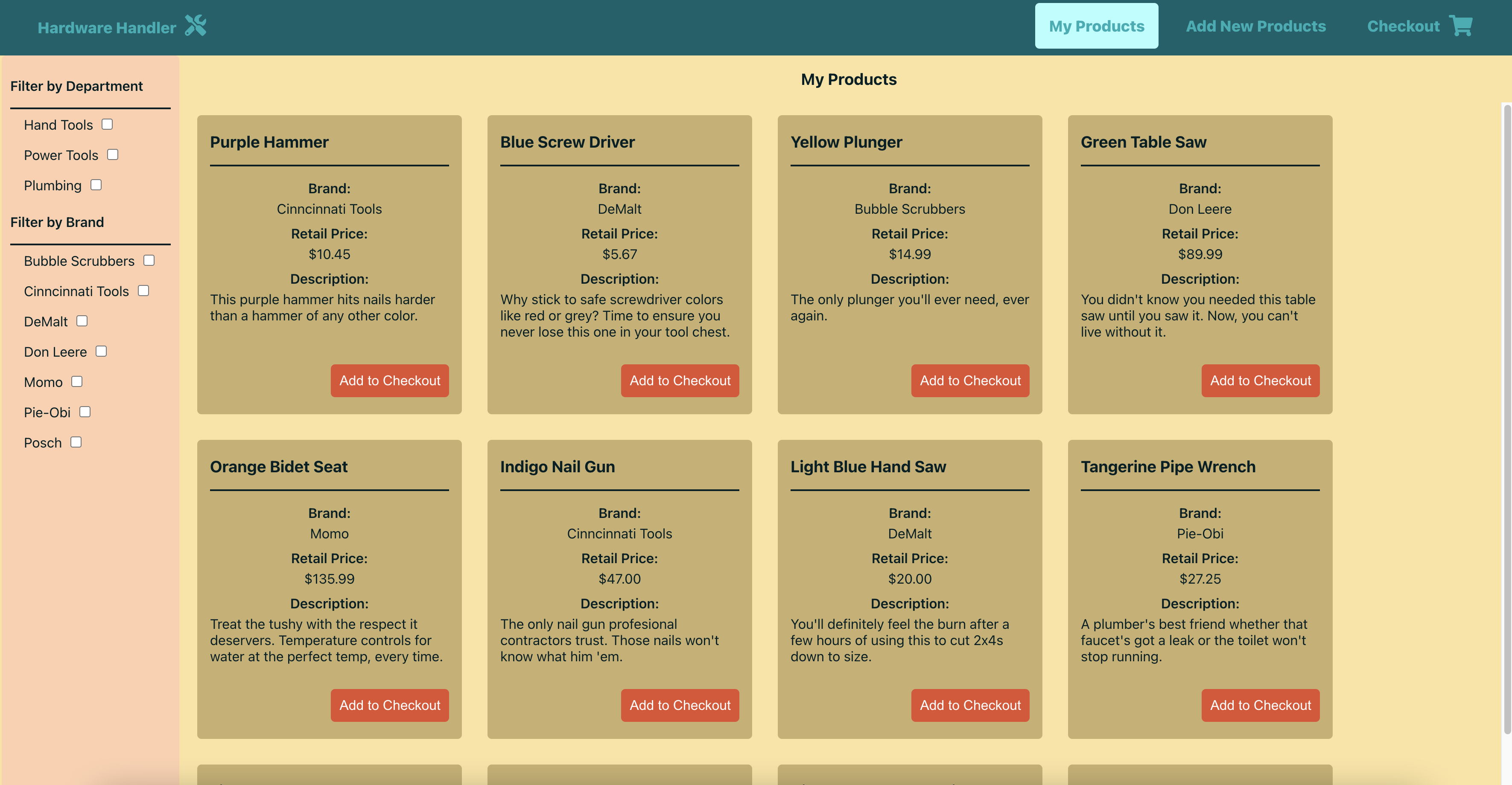
Below is a video of what the final page looks like: notice the page title and filters on the lefthand side stay in place while the product cards scroll down in the main content space.
Set up the ProductList component’s HTML (or JSX)
Before we can start applying the CSS Grid Layout to our page, we must actually code a page full of HTML elements to apply the grid to.
My project was built with the React framework, so the example code I’ll be walking through would normally contain React Hooks, state, functions, and JSX, but for this blog post, everything besides the JSX is largely unnecessary, so I’ve cut it out.
It should be relatively straightforward to translate the remaining JSX into HTML or another JS-powered framework, if you so desire.
Here’s a condensed version of the actual ProductList component, please note I’ve eliminated much of the React-specific code and things like error handling messages, loading components, etc. to focus on the HTML that our CSS will apply to.
ProductList.js
// other imports for React, components, constants, etc.
import './ProductList.css';
const ProductList = () => {
// all sorts of state variables here: products, loading, errors, etc.
// logic to facilitate adding items to checkout
// logic for filtering products based on brand name or department
return (
<div className="product-list-container">
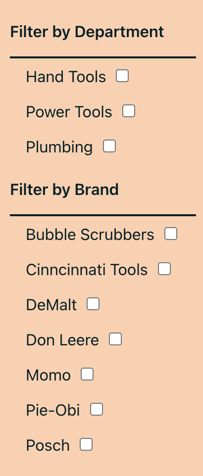
<section className="filter-wrapper">
<p className="filter-title">Filter by Department</p>
<div className="filter-data">
{filtersByDepartment.map((filter) => (
<span key={filter.id} className="filter-item">
<label htmlFor={filter.id}>{filter.name}</label>
<input
className="filter-checkbox"
id={filter.id}
type="checkbox"
checked={activeFilter.includes(filter.id)}
onChange={() => onFilterChange(filter.id)}
/>
</span>
))}
</div>
<p className="filter-title">Filter by Brand</p>
<div className="filter-data">
{filtersByBrand.map((filter) => (
<span key={filter.value} className="filter-item">
<label htmlFor={filter.value}>{filter.name}</label>
<input
className="filter-checkbox"
id={filter.value}
type="checkbox"
checked={activeFilter.includes(filter.value)}
onChange={() => onFilterChange(filter.value)}
/>
</span>
))}
</div>
</section>
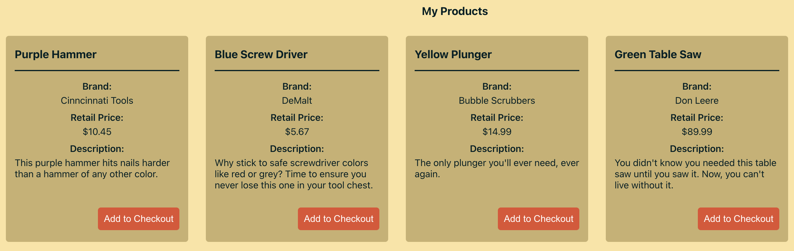
<h1 className="product-list-header">My Products</h1>
<section className="products-container">
<div className="product-list-product-wrapper">
{filteredList.map((product) => (
<Product
key={product.id}
product={product}
addItemToCheckout={addItemToCheckout}
/>
))}
</div>
</section>
</div>
);
};
export default ProductList;I cut out a lot of unneeded noise, but that’s still plenty happening in this component to render both a list of all the products and two different filtering options, so let’s talk through what’s happening in this code snippet.
The first section tag is wrapping our various filters:
- One filtering option users have is to filter products by department, hence the array-based state variable titled
filtersByDepartment, - And the other filtering option is to filter products by brand name:
filtersByBrand.
Each of these arrays of data produces a set of checkboxes that users can check to narrow down the list of products being displayed on screen at any one time.
Which brings us to the final section of the JSX where the filteredList variable is being rendered - that variable is a list of all the products that fit into the selected filter criteria.
Also take note of the classes attached to many of these elements: product-list-container, filter-wrapper, product-container - they’ll come into play in the next section when we write the CSS.
I’ve omitted the filtering logic that’s also in this component because it isn’t central to illustrating the point in this post.
And that’s what’s going on in this component.
Add CSS Grid to Our HTML
With our JSX (or HTML) set up, we can get to the CSS portion of this blog post. This is the entirety of the CSS contained in our ProductList.css file - there are some things that are being inherited from other global CSS - things like background-color or font-size, but by and large, this is all you’ll need to achieve the desired effect.
ProductList.css
/* styling for the whole product list container, including the filters on the side */
.product-list-container {
  display: grid;
  grid-template-rows: 55px calc(100vh - 55px);
  grid-template-columns: 220px auto;
  grid-template-areas:
    'filter header'
    'filter products';
}

/* styling for just the main list of products displayed on screen */
.product-list-header {
  display: flex;
  align-items: center;
  justify-content: center;
  grid-area: header;
}

.products-container {
  grid-area: products;
  overflow: auto;
}

.product-list-product-wrapper {
  display: flex;
  flex-wrap: wrap;
  margin: auto;
}

/* styling for the filters */
.filter-wrapper {
  padding: 10px;
  background-color: #ffcfae;
  grid-area: filter;
  height: 100vh;
}

.filter-title {
  font-weight: 600;
}

.filter-data {
  display: flex;
  flex-direction: column;
  flex-wrap: wrap;
  border-top: 2px solid #012025;
}

.filter-item {
  margin: 8px 16px;
}

.filter-checkbox {
  margin-left: 10px;
}
You’ll notice as you look through the CSS that I have two distinct sets of classes in here:
- Ones that are
productbased - And ones that are
filterbased.
It should be fairly self-explanatory what each set of classes is responsible for styling in the JSX; aside from the product-list-container that styles the whole page (and lays out our overall grid), product classes are for the product cards displayed on the page.
And filter classes are for the filters on the left hand side.
Let’s talk about some of the individual CSS classes in the code snippet now.
product-list-container
.product-list-container {
  display: grid;
  grid-template-rows: 55px calc(100vh - 55px);
  grid-template-columns: 220px auto;
  grid-template-areas:
    'filter header'
    'filter products';
}
The product-list-container CSS at the beginning of the file is the first thing we need to focus on here because it’s where the CSS Grid is defined and laid out.
display: grid: Just like when using CSS Flexbox, the first thing we must do to let our CSS know we intend to use Grid instead ofdisplay: flexordisplay: block, is set thedisplayproperty togridgrid-template-rows: 55px calc(100vh - 55px): Next, we define the rows we want our grid to have.- If you look at my page’s layout below the nav bar which is always present, there’s the page header that says “My Products” and then the body of the rows of product cards, so in our case there really only needs to be two rows: one for the header and another for the list of products.
- Looking at the code, I gave the page title
55pxof room and then the cards the remaining portion of the viewport to the cards by using the CSScalcfunction to subtract the55pxfrom whole height of the viewport:100vh.
grid-template-columns: 220px auto: As with defining rows, CSS Grid also allows us to define columns, and since this page has a side bar and a main content portion, 2 columns should do just fine. The sidebar portion will be220pxwide and the rest of the space will be taken up by the products, soautowill suffice here.grid-template-areas: 'filter header' 'filter products': This last line is an interesting one. While there’s multiple ways to lay out CSS Grid, one of the handiest features is the ability to usegrid-template-areaswhich let you name grid areas and then lay them out according to those names.- Oftentimes
grid-rowandgrid-columnwill suffice to place things where they belong on the grid, but in this instance,grid-template-areasmakes it really easy to lay out everything exactly as it should be on the page.
- Oftentimes
As you can see from looking at the code, the grid element named filter will take up both grid rows, and the first grid column (the one that is 220px wide).
The grid element header will take up just the first row of the grid (the 55px high row), and the second column, and the grid element products will take up the second row and second column of the grid (all the remaining space, basically).
And now that the CSS grid is laid out and its columns and rows are defined, all that’s left is to name the classes to match the grid elements defined.
product-list-header
.product-list-header {
  display: flex;
  align-items: center;
  justify-content: center;
  grid-area: header;
}
We’ll just work our way down the CSS, I think that’s easiest here, and the first class we’ll focus on after product-list-container is product-list-header. The name should give you a hint of what this class is for: it wraps the “My Products” title of the page.
In addition to a little CSS Flexbox magic to align the “My Products” page title both horizontally and vertically within its space on the page, it also gets assigned a grid area.
grid-area: header: Thegrid-areais the property that tells an element where it should live within the parent grid container, so by giving this element the named grid area ofheader, it knows it should fit into theheaderspace as defined in thegrid-template-areain theproduct-list-containerclass.
products-container
.products-container {
  grid-area: products;
  overflow: auto;
}
The next class we encounter on the way down the CSS file is the products-container class. This element only needs two CSS properties:
grid-area: products: Once more, we assign this element thegrid-areaname ofproducts, telling it that it should occupy all the space in the grid defined asproducts.overflow: auto: We also need to add the property ofoverflow: autoso that the list of products will scroll independently of the other elements on the page: theheaderand thesidebar.
overflow: auto; is a key ingredient to our fixed sidebar remaining fixed.
Without it, if there’s more products than can be displayed at once on screen, the products will still wrap and take up all the space they need but the whole grid will scroll to display them (including scrolling beyond the space the sidebar occupies). No bueno.
Just don’t forget to add this property to the
products-container.
filter-wrapper
.filter-wrapper {
  padding: 10px;
  background-color: #ffcfae;
  grid-area: filter;
  height: 100vh;
}
Then we have to skip down through a few classes that exist to organize the products so they lay out nicely in rows on the page, regardless of the amount of items, until we come to the filter-wrapper class.
There’s some standard padding, and background-color CSS properties at work, but the two properties to focus on are:
grid-area: filter: Our finalgrid-areadesignation has arrived. This class gets thefilterproperty, so it will know to fill up the left hand side of the screen for both grid rows.height: 100vh: The viewport height (vh) unit makes another appearance for this element. Setting the filter element’s height to100vhensures it will always go down to the bottom of the page (and look like a true sidebar) no matter how many actual filters are available or how far down the product list a user scrolls.
Then after this class there’s a few additional ones to lay out all the filter checkboxes in a nice vertical row with some decent spacing between them.
Again, not as important to this particular post as the four classes highlighted above.
And that’s it: a fixed sidebar with other elements on the page that can scroll freely.
Conclusion
Building a sample application for users taking my course about how to modernize React applications helped me learn some cool new web development techniques along the way, not the least of which was how to build a page with a static sidebar and a scrolling center section using CSS Grid.
While this tutorial used CSS Grid to build a fixed sidebar, it could be applied to so many different situations that call for something similar: a table of contents for a blog post, a set of store details alongside a map of their locations, food items already in a cart as a user adds more to the list - the possibilities go on.
Thanks for reading. I hope you enjoyed seeing how just a few CSS Grid commands can eliminate the need to break the DOM flow with CSS like position: fixed and still give fine grained control. It takes a little practice to get the hang of CSS Grid, but once you do, I guarantee you won’t want to go back. I can’t imagine doing web development today without CSS Flexbox and CSS Grid at my fingertips.
If you enjoyed this post, you may also be interested in checking out my full course “The newline Guide to Modernizing an Enterprise React App”.
In 10 modules and 54 lessons, I cover all the things I learned while building applications at The Home Depot. I deep dive into building and maintaining large, mission-critical React applications - because at big companies like this, it’s about so much more than just making the code work.
From tooling and refactoring, to testing and design system libraries, there’s a ton of material and hands-on practice here to prepare any React developer to build software that lives up to today’s high standards. I hope you’ll check it out.
References & Further Resources
- CSS Grid Mozilla docs
- CSS-Tricks: A Complete Guide to Grid
- The newline Guide to Modernizing an Enterprise React App course
- CSS Flexbox Mozilla docs
- CSS-Tricks: A Complete Guide to Flexbox