
Introduction
Over the summer of 2021 I started working for an Internet of Things (IoT) startup, Blues Wireless that aims to make IoT development easy - even when reliable Internet connections are not available. Blues does this via Notecards - prepaid cellular devices that can be embedded into any IoT device “on the edge” to transmit sensor data as JSON to a secure cloud: Notehub.
I am not a hardware or firmware engineer however, web development is my area of expertise (frontend in particular), so to dip my toes into IoT development, I started off building a simpler project: an asset tracker using only a Blues Notecard, Blues Notecarrier AL with a built-in GPS antenna, and a small lithium-ion polymer (LiPo) battery to power it all.
With the help of the Blues developer experience docs, I had temperature, voltage, and GPS location data being delivered to the Notehub cloud from my tracker in under 30 minutes. That’s cool and all, but the way that data from sensors in the world really becomes useful is when it’s displayed to users in some sort of UI, right? It could be maps, tables, or in my case, charts.
So I wanted to take my data from the Notehub cloud and pump it into a custom-made dashboard to track and display the Notecard’s location, voltage, and sensor readings in the real world. React is my current JavaScript framework of choice, and I decided to build a Next.js TypeScript-powered dashboard, and I learned a ton of interesting things in the process, which I intend to share with you over a series of blog posts in the next few months.
If you missed my first blog post installment all about building an asset tracking map in Next.js using React Leaflet, you can read it here.
Today, I plan to show you how to build charts and a custom styled tooltip in a Next.js application with the Recharts Library, using real-world data from a third-party API source.
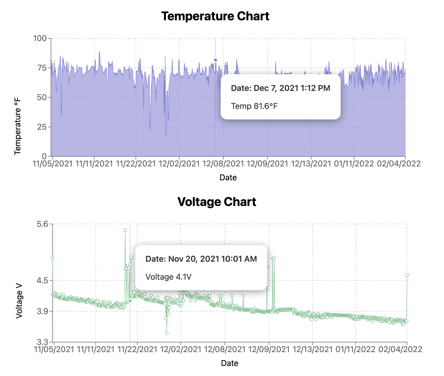
Here’s what the final dashboard looks like - the temperature and voltage charts are the focus for this particular post.
Create chart components in the Next.js app
NOTE This article will not go through the initial setup of a brand new Next.js app - that’s outside the scope of this blog. If you’re starting from scratch, I would recommend following the Next.js starter app with TypeScript documentation.
If you’d prefer, you can also fork and download my whole, working code base from the GitHub repo here.
Install chart dependencies
To get started adding charts to our Next.js application, we have to install the Recharts library. Recharts is a chart library built with React and the popular data visualization library D3, and it makes it easy to use React-based chart components that feel familiar to make all sorts of different types of charts, while still allowing a high degree of flexibility for customization, as needed.
The API and examples documentation for Recharts are thorough, and I’d highly encourage you to read them to get a feel for the variety of charts available and how to work with them.
Install the Recharts library in the Next.js app with the following commands in a terminal.
$ npm install rechartsThis is the only new library needed to get Recharts up and running, even when using TypeScript, so it’s time to move on and make some various chart components.
Set up a <TempChart > component
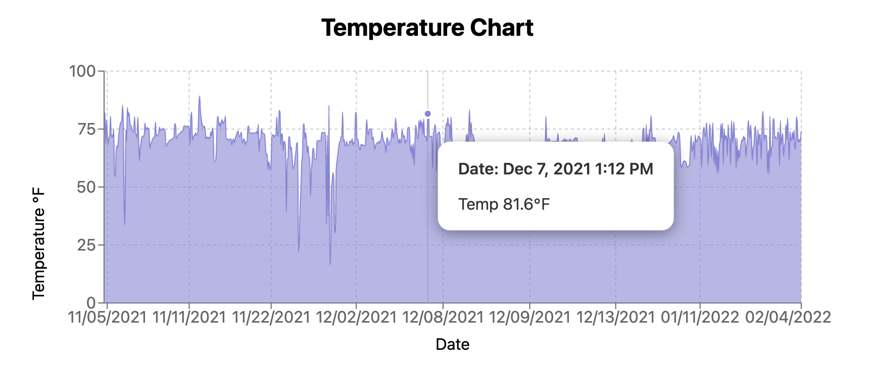
The first type of chart component we’ll create for the dashboard will be used to display the temperature data supplied by the Notecard. This will be an area chart that looks like the image here.
Since this component will have the sole goal of displaying temperature data, create a new file in the repo named TempChart.tsx, and paste the following code into it. The actual code in GitHub is available by clicking the file title below.
import {
AreaChart,
Area,
XAxis,
YAxis,
Label,
CartesianGrid,
Tooltip,
ResponsiveContainer,
} from "recharts";
import CustomTooltip from "./CustomTooltip";
type tempDataProps = {
shortenedDate: string;
date: string;
temp: number;
}[];
const TempChart = ({ tempData }: { tempData: tempDataProps }) => {
return (
<>
<h2>Temperature Chart</h2>
<ResponsiveContainer width={"100%"} height={300} min-width={300}>
<AreaChart
data={tempData}
margin={{
top: 10,
right: 30,
left: 20,
bottom: 30,
}}
>
<CartesianGrid strokeDasharray="3 3" />
<XAxis dataKey="shortenedDate">
<Label value="Date" position="bottom" />
</XAxis>
<YAxis dataKey="temp">
<Label
value="Temperature ℉"
angle={-90}
position="left"
dy="-10"
/>
</YAxis>
<Tooltip content={<CustomTooltip payload={tempData} />} />
<Area
type="monotone"
dataKey="temp"
stroke="#8884d8"
fill="#8884d8"
/>
</AreaChart>
</ResponsiveContainer>
</>
);
};
export default TempChart;There’s a lot of imports from Recharts happening in this component, so let’s go through them one by one to understand what their purposes are.
Each of the imports from the recharts library at the very top of the file represent a different component used to make this chart display correctly.
AreaChartis the container for all the chart data and is how Recharts knows what type of chart it’s rendering.Areais where the array of data to be displayed by the chart is passed. Thestrokeandfillproperties in the<Area>component allow us to define the chart’s line color and fill color as hex codes.- (Note: if there was more than one array of temperature data this chart needed to display - say, for multiple Notecards reporting data, a second
<Area>component would be included in the JSX underneath the first instance)
- (Note: if there was more than one array of temperature data this chart needed to display - say, for multiple Notecards reporting data, a second
- XAxis and YAxis are how the chart knows what the X and Y axes of the chart should use as their data displays.
- The
dataKeyproperty inside of the axis component is the property name of the array data being passed to the chart. For example, each item in the array of data being passed to the temperature chart’s<YAxis>has a property of"temp", so that is thedataKeyfor the<YAxis>component.
- The
Labelmust always be a child component of theXAxisorYAxiscomponent and it displays a custom axis label.- I like it because the chart label, label angle, value, positioning, and more can be changed very easily here.
CartesianGriddraws the nice squares which align with the cartesian coordinate axes.- This is not a required component, but I think it improves chart readability. The
strokeDasharrayproperty is customizable, so feel free to play with the numbers to find a square pattern that suits you.
- This is not a required component, but I think it improves chart readability. The
Tooltipalthough our tooltip will end up being a custom component, in order to display it the custom one, we must pass it into the generic<Tooltip>component as the propertycontent. We’ll get into this more when we create the tooltip component, so put a pin in this for now.ResponsiveContainerwraps the whole chart component and makes it responsive to the size of the parent container. Although the chart component itself can be given aheightandwidth, they’re static. When passing the<ResponsiveContainer>component width and height props, one should be a percentage string.- For my component, the
widthiswidth={100%}, for this reason.
- For my component, the
The only other import to this file is the <CustomTooltip> component and we’ll get to this component in depth soon.
After all the imports, the tempDataProps are defined for the TypeScript array of data being passed to this chart. The props are pretty simple: each object in the array will contain:
- A
shortenedDate(this is a simplified date format of MM/DD/YYYY) to display in the<XAxis>component, - A
date- the longer form date of MMM D, YYYY h:mm A to display in the tooltip, - And a
temp- the actual temperature.
Finally, all of these chart components are composed in the JSX to make a responsive area chart with dates on the X axis, temperature on the Y axis, a lavender stroke and fill color, and a custom tooltip.
Build a <VoltageChart> component
The second chart component we’re going to build is for the Notecard’s voltage levels over time. The Notecard is designed to be ultra low power so even small batteries can power it for long stretches of time (multiple years, even), but it’s still good to keep an eye on the voltage so if it does start to drop, the LiPo battery can be recharged or swapped out.
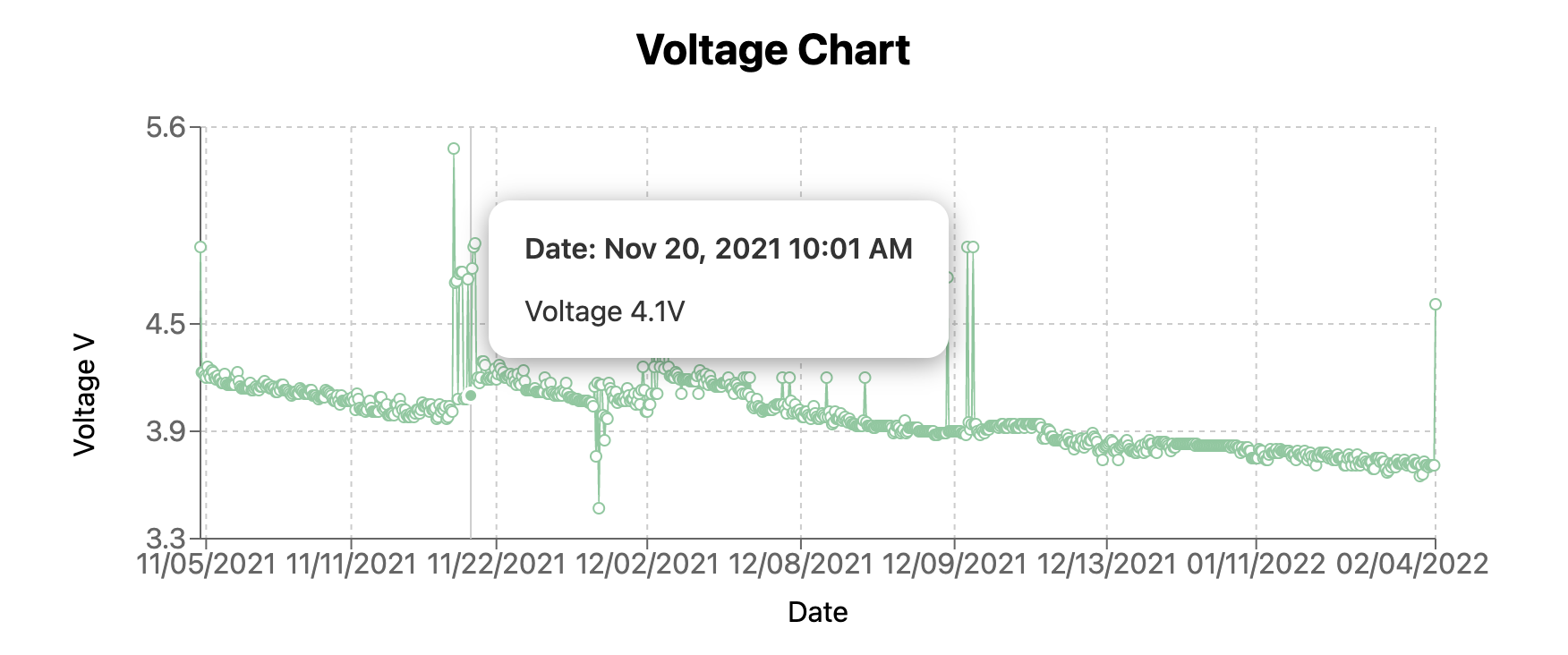
This component will be a standard line chart instead of an area chart, so create a new component file named VoltageChart.tsx in your project.
A lot of the code for the <VoltageChart> component should feel familiar when you read over it - it’s quite similar to the <TempChart> component’s code. As before, you can click the file title to go the GitHub code.
Yes, this chart code isn’t the DRYest (don’t repeat yourself).
If this was a larger project with more charts, I would work to make some more generic, “base chart” components to be more flexible for various purposes, but since it’s a relatively small app with just a two charts, I kept it simpler.
import {
  LineChart,
  Line,
  XAxis,
  YAxis,
  Label,
  CartesianGrid,
  Tooltip,
  ResponsiveContainer,
} from "recharts";
import CustomTooltip from "./CustomTooltip";

type voltageDataChart = {
  shortenedDate: string;
  date: string;
  voltage: number;
}[];

const VoltageChart = ({ voltageData }: { voltageData: voltageDataChart }) => {
  return (
    <>
      <h2>Voltage Chart</h2>
      <ResponsiveContainer width={"100%"} height={300} min-width={300}>
        <LineChart
          data={voltageData}
          margin={{
            top: 10,
            right: 30,
            left: 20,
            bottom: 30,
          }}
        >
          <CartesianGrid strokeDasharray="3 3" />
          <XAxis dataKey="shortenedDate">
            <Label value="Date" position="bottom" />
          </XAxis>
          <YAxis dataKey="voltage" type="number" domain={[3.3, 5.6]}>
            <Label value="Voltage V" angle={-90} position="left" dy="-10" />
          </YAxis>
          <Tooltip content={<CustomTooltip payload={voltageData} />} />
          <Line type="monotone" dataKey="voltage" stroke="#82ca9d" />
        </LineChart>
      </ResponsiveContainer>
    </>
  );
};

export default VoltageChart;
As with the <TempChart>, the <VoltageChart> imports all the same Recharts components except it uses LineChart and Line to indicate that this chart will be displayed as a line chart instead of an area chart and tell the <Line> component the type will be an unbroken monotone type with a soft green stroke color.
Beyond these key differences everything else is much the same: same <ResponsiveContainer> chart wrapper, similarly shaped voltageData array (the temp property on each object is replaced by voltage here), same X and Y axis data (although this Y axis has a domain property that sets the upper and lower bounds of the chart), and even the same <CustomTooltip> component.
So now that we’ve defined our charts, it’s time to dive into that <CustomTooltip> component.
Make a <CustomTooltip> component and style it
This is where things stopped being so straightforward. If we examine the Recharts tooltip API documentation closely, you’ll see mention of the method content as a way to render a custom tooltip, lucky for us, this method links to example code so we can see what props a custom tooltip component can take, including CSS styling.
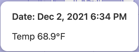
Here is what our custom tooltip is going to end up looking like.
In the app, make a new component file named CustomTooltip.tsx, and go ahead and make a new style file named CustomTooltip.modules.scss.
I’m using Sass in my Next project in addition to the built-in CSS module styling.
There’s very little Sass nesting going on in this particular SCSS file so I think it will be easy enough to follow, but if you’d like to set up Sass in your own Next project, you can follow Next’s directions here.
import styles from "../../styles/CustomTooltip.module.scss";
const CustomTooltip = ({ active, payload }: any) => {
if (active && payload && payload.length) {
return (
<div className={styles.customTooltip}>
<div className={styles.tooltipDetails}>
<p className={styles.label}>Date: {payload[0].payload.date}</p>
{payload[0].payload.temp ? (
<p>Temp {payload[0].payload.temp}℉</p>
) : (
<p>Voltage {payload[0].payload.voltage}V</p>
)}
</div>
</div>
);
}
return null;
};
export default CustomTooltip;The CustomTooltip component here takes in two props:
active- a boolean denoting if a tooltip should be displayed (this happens when a user mouses over the chart on desktop or clicks on a particular point on mobile),payload- the data the tooltip will be displaying from the chart. For us, we want the chart’s temp (or voltage) and the more specificdatetimestamp in our tooltip.
The custom tooltip’s JSX checks if active is true for a particular data point and if the payload exists as a single object in the array. If both conditions are met, the tooltip displays the longer format date and either the temperature or voltage depending on which chart the tooltip’s being invoked with.
Once again, for a larger project the display would need to be redesigned to be more flexible to whatever data props were being passed in.
Our data’s being displayed in the tooltip, now to give it a little styling to look decent.
.customTooltip {
  background: white;
  color: #333;
  box-shadow: 0 3px 14px rgb(0 0 0 / 40%);
  padding: 1px;
  text-align: left;
  border-radius: 12px;

  .tooltipDetails {
    margin: 13px 19px;
  }

  .label {
    font-weight: 600;
  }
}
The customTooltip class wraps all the tooltip data, giving it a white background, black text with a little padding, a slight box shadow, and some nicely rounded corners. Nested inside of this class are tooltipDetails which defines some margins around the text, and label, which gives extra emphasis to the font.
Then import the SCSS file into the CustomTooltip component file, define the module’s name as styles and plug in the corresponding CSS in the correct components in the JSX. Now when this component is imported into the two chart components, it should look good and display the more specific tooltip data we want.
With that done, we’re ready to start using these components in the dashboard page.
Render the charts in the application
Ok, so in the main file where all our dashboard components are imported, let’s add our charts and prepare to pass data to them.
// imports
import TempChart from "../src/components/TempChart";
import VoltageChart from "../src/components/VoltageChart";
// other imports

type dataProps = {
// condensed for code brevity
};

export default function Home({ data }: { data: dataProps[] }) {
// logic to transform data into the arrays needed to pass to the charts

return (
    <div>
      {/* extra tracker app code */}
      <main>
        <h1>React Blues Wireless Asset Tracker</h1>
        <div>
          <TempChart tempData={tempData} />
        </div>
        {/* other tracker components */}
        <div>
          <VoltageChart voltageData={voltageData} />
        </div>
        {/* other tracker components */}
      </main>
    </div>
  );
}

// more code down here: getStaticProps that fetches the data
There’s not much to these imports, they’re standard default imports to get these components into the file. After the two chart components are imported, they’re rendered inside of the JSX down at the bottom of the file. The getStaticProps function at the bottom of the file that I’ve written a comment for is where the Notehub data gets pulled into the app, and the comment right under our export default function line is where we’ll transform that raw data into the tempData and voltageData arrays that our charts need.
Let’s get to it.
Pull in data for the charts
In my previous asset tracking dashboard article I went into great detail about how to create your own asset tracker to generate real data for the app using Blues Wireless hardware and a data fetching function.
If you’d like to follow along there to build your own tracker and route data to Notehub, please be my guest.
For this post, I’ll jump ahead to the part where we’re already pulling data into the app via a Next.js getStaticProps API call. The JSON data from the Notehub cloud looks like this:
[
  {
    "uid": "d7cf7475-45ff-4d8c-b02a-64de9f15f538",
    "device_uid": "dev:864475ABCDEF",
    "file": "_track.qo",
    "captured": "2021-11-05T16:10:52Z",
    "received": "2021-11-05T16:11:29Z",
    "body": {
      "hdop": 3,
      "seconds": 90,
      "motion": 76,
      "temperature": 20.1875,
      "time": 1636123230,
      "voltage": 4.2578125
    },
    "gps_location": {
      "when": "2021-11-05T16:10:53Z",
      "name": "Sandy Springs, GA",
      "country": "US",
      "timezone": "America/New_York",
      "latitude": 33.913747500000014,
      "longitude": -84.35008984375
    }
  },
  {
    "uid": "3b1ef772-44da-455a-a846-446a85a70050",
    "device_uid": "dev:864475ABCDEF",
    "file": "_track.qo",
    "captured": "2021-11-05T22:22:18Z",
    "received": "2021-11-05T22:23:12Z",
    "body": {
      "hdop": 2,
      "motion": 203,
      "seconds": 174,
      "temperature": 22,
      "time": 1636150938,
      "voltage": 4.2265625
    },
    "gps_location": {
      "when": "2021-11-05T22:22:19Z",
      "name": "Doraville, GA",
      "country": "US",
      "timezone": "America/New_York",
      "latitude": 33.901052500000006,
      "longitude": -84.27090234375
    }
  },
  {
    "uid": "e94b0c68-b1d0-49cb-8361-d622d2d0081e",
    "device_uid": "dev:864475ABCDEF",
    "file": "_track.qo",
    "captured": "2021-11-05T22:40:04Z",
    "received": "2021-11-05T22:46:30Z",
    "body": {
      "hdop": 1,
      "motion": 50,
      "seconds": 41,
      "temperature": 21.875,
      "time": 1636152004,
      "voltage": 4.1875
    },
    "gps_location": {
      "when": "2021-11-05T22:40:05Z",
      "name": "Peachtree Corners, GA",
      "country": "US",
      "timezone": "America/New_York",
      "latitude": 33.9828325,
      "longitude": -84.21591015624999
    }
  },
  {
    "uid": "1344517c-adcb-4133-af6a-b1132ffc86ea",
    "device_uid": "dev:864475ABCDEF",
    "file": "_track.qo",
    "captured": "2021-11-06T03:04:07Z",
    "received": "2021-11-06T03:10:51Z",
    "body": {
      "hdop": 1,
      "motion": 126,
      "seconds": 218,
      "temperature": 12.5625,
      "time": 1636167847,
      "voltage": 4.1875
    },
    "gps_location": {
      "when": "2021-11-06T03:04:08Z",
      "name": "Norcross, GA",
      "country": "US",
      "timezone": "America/New_York",
      "latitude": 33.937182500000006,
      "longitude": -84.25278515625
    }
  }
]
Each JSON object in this array is a separate _track.qo motion event that displays the Notecard’s current location and sensor readings. The part of the object that we care about in this particular post is the body.temperature and body.voltage values. This is the data our charts need.
If you’d like to save setting up your own asset tracker, you can paste this small set of events into your app’s
index.jsfile to simulate the data being fetched from Notehub, for testing purposes.
Take that data and reshape it to work with our chart and tooltip components
With the correct shape of our data being fed into our app (either via getStaticProps and Notehub) or the JSON test data I shared above, it’s time to reshape this data.
I’ve condensed down the logic to make this file easier to read, but you can see the full file on GitHub.
// imports
import { useState } from "react";
import dayjs from "dayjs";
import { convertCelsiusToFahrenheit } from "../src/util/helpers";
// other imports

type dataProps = {
// condensed for code brevity
};

export default function Home({ data }: { data: dataProps[] }) {

// state variables for the various pieces of data passed to the charts
  const [tempData, setTempData] = useState<
    { date: string; shortenedDate: string; temp: number }[]
  >([]);

  const [voltageData, setVoltageData] = useState<
    { date: string; shortenedDate: string; voltage: number }[]
  >([]);

  // logic to transform data into the items needed to pass to the charts
  useEffect(() => {
    const temperatureDataArray: {
        date: string;
        shortenedDate: string;
        temp: number;
        }[] = [];
    const voltageDataArray: {
        date: string;
        shortenedDate: string;
        voltage: number;
        }[] = [];

    if (data && data.length > 0) {
      data
        .sort((a, b) => {
          return Number(a.captured) - Number(b.captured);
        })
        .map((event) => {
          const temperatureObj = {
            date: dayjs(event.captured).format("MMM D, YYYY h:mm A"),
            shortenedDate: dayjs(event.captured).format("MM/DD/YYYY"),
            temp: Number(convertCelsiusToFahrenheit(event.body.temperature)),
          };
          temperatureDataArray.push(temperatureObj);
          const voltageObj = {
            date: dayjs(event.captured).format("MMM D, YYYY h:mm A"),
            shortenedDate: dayjs(event.captured).format("MM/DD/YYYY"),
            voltage: Number(event.body.voltage.toFixed(2)),
          };
          voltageDataArray.push(voltageObj);
        });
    }
    setTempData(temperatureDataArray);
    setVoltageData(voltageDataArray);
  }, [data]);

return (
    <div>
      {/* extra tracker app code */}
      <main>
        <h1>React Blues Wireless Asset Tracker</h1>
        <div>
          <TempChart tempData={tempData} />
        </div>
        {/* other tracker components */}
        <div>
          <VoltageChart voltageData={voltageData} />
        </div>
        {/* other tracker components */}
      </main>
    </div>
  );
}

// getStaticProps call to Notehub
Here’s what’s happening in this file, we declare two new React state variables: tempData and voltageData - these arrays are what get passed to the chart components. Each of these variables is an object with three properties: date, shortenedDate, and either temp or voltage.
Then, inside of a useEffect function that runs as soon as the data variable is available via the getStaticProps call, we sort the data, and then iterate over each object in the original data array and create a new temperatureObj and voltageObj from the data that gets pushed into the temperatureDataArray and voltageDataArray variables declared at the very top of the useEffect.
Finally, those arrays are set into the component’s state with our useState variables. At this point, you should have a couple of nice looking charts displaying a few points of data about your Notecard’s voltage and temperature.
If you look closely, you can see a couple of extra imports at the top of this code example for the
dayjslibrary and a helper function I namedconvertCelsiusToFahrenheit. Thedayjslibrary helps make date time formatting significantly easier for ourdateandshortenedDateproperties for our new data arrays andconvertCelsiusToFahrenheittakes the Notecard’s temp (reported in Celsius) and makes it Fahrenheit. Neither of these things is complicated, but I wanted to point them out for the very observant among you.
Conclusion
Once I started working for an IoT startup, getting more familiar with the possibilities of what sensors could report from the real world became more of a focus for me - but still from a web development perspective. To that end, I built a web dashboard pulling data from our hardware devices out in the field: location, temperature, battery voltage, etc.
For the data like temperature and voltage, charts seemed most appropriate to display the changing values over time, and so I chose the Recharts library to help with these data visualizations. The library’s easy to work with and produces some nifty looking charts without too much effort on my part, and when I wanted to style my own tooltip and display some custom data, that was straightforward too.
This dashboard actually came in handy when my parents’ car was stolen from their driveway the night after Thanksgiving. If you want to hear the whole story and build your own tracker, check out this blog post and video I made for Blues Wireless - it details the whole process from hardware to software to deploying to Netlify.
Check back in a few weeks — I’ll be writing more about JavaScript, React, IoT, or something else related to web development.
Thanks for reading. I hope you enjoyed learning how to create a couple of charts and custom tooltips using the Recharts library - slick data visualizations have so many potential applications for transforming lots of data points into meaningful data people can draw conclusions from.
References & Further Resources
- Hackster.io original asset tracker project
- Asset tracker GitHub repo
- Recharts chart library
- Blues Wireless website
- Blues Wireless developer experience site
- Previous article about rendering maps in a Next.js application